NOVI UX Strategy & Product Interface Design
UX-driven mobile app concept with mood tracking, micro-exercises, and habit system design.
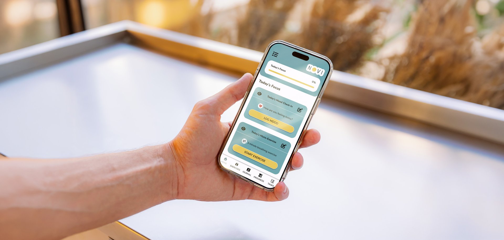
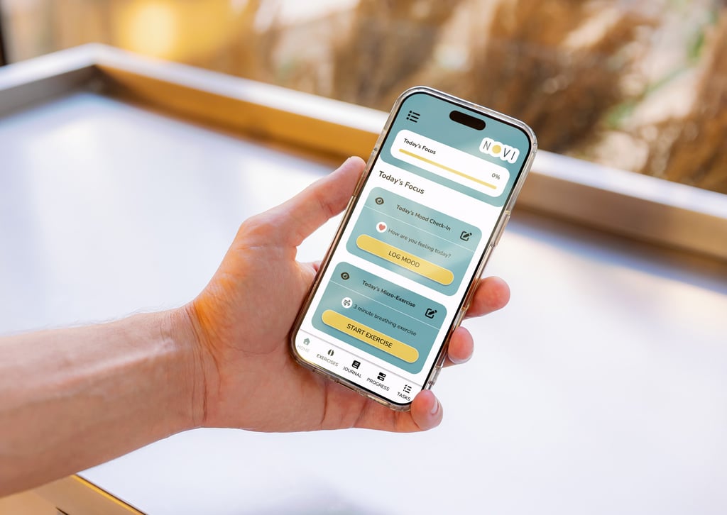
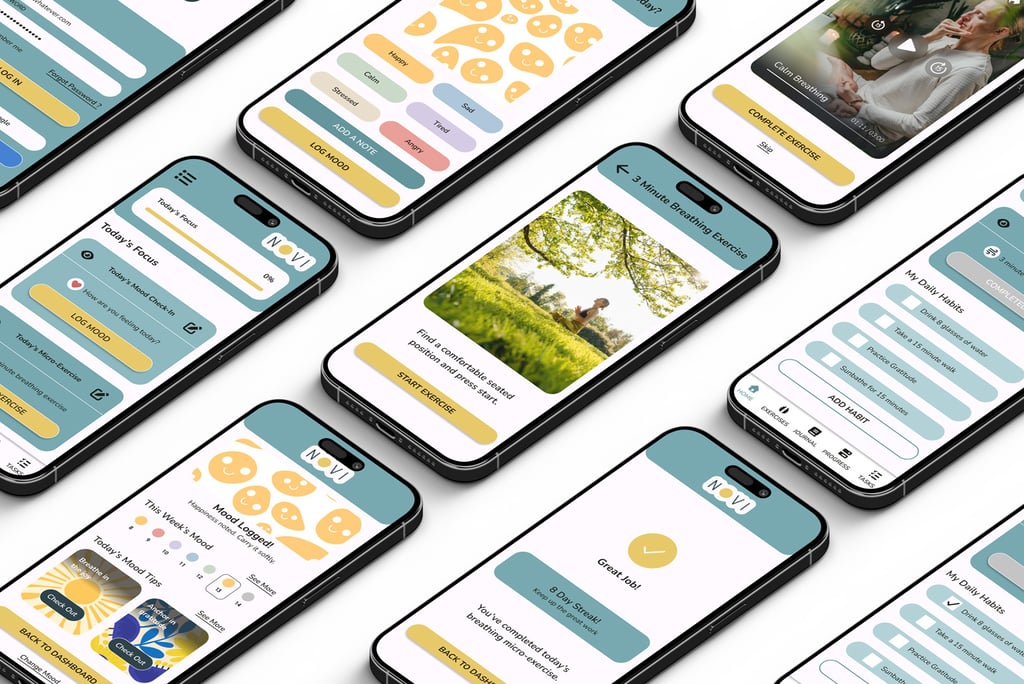
NOVI is a mental wellness concept app designed to help users build consistency through quick daily actions: a mood check-in, a short evidence-based micro-exercise, and optional habit tracking, all designed to fit into a session under five minutes. This project explores how calm visual communication and structured UX can reduce friction and make self-care feel achievable.
PROBLEM
Many wellness apps offer valuable content, but they often become difficult to maintain: they can feel content-heavy, time-intensive, or overly gamified.
NOVI addresses a specific gap: a calm, minimal, non-overstimulating experience that supports self-awareness and consistency without requiring long sessions.
SOLUTION
A focused daily loop:
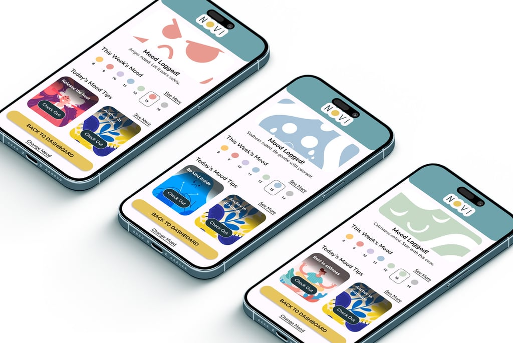
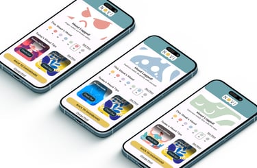
• Log mood
• Complete one short micro-exercise
• Exit with clarity
Habits remain separate to avoid progress inflation.
GOAL + SUCCESS METRIC
Goal: Design a flow that lets a user log their mood, complete a short micro-exercise, and maintain a sense of progress in under five minutes.
Success metric: Consistency, the interface prioritizes reduced session time and clear completion feedback so the user can return daily without feeling overwhelmed.
Opportunity
Existing wellness apps often rely on extensive content libraries, gamification, or complex habit systems. While engaging, these approaches can introduce cognitive overload and longer user sessions.
Competitive Insight
NOVI focuses on a lighter interaction model: one mood check-in and one short micro-exercise per day, designed for fast completion and consistent daily use.
Designed for users like Oliver Busy, time-limited, and seeking calm structure. He prefers short sessions, minimal UI, and clear feedback.
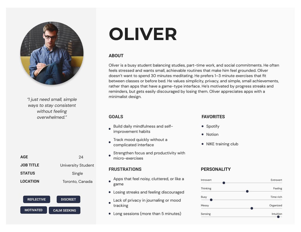
USER PERSONA
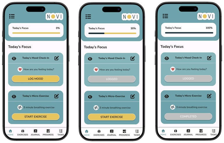
UX STRATEGY
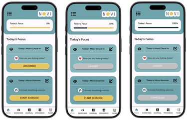
0% — Nothing completed
30% — Mood logged
100% — Micro-exercise completed
Clear logic reduces cognitive load.
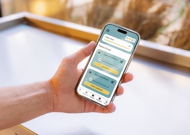
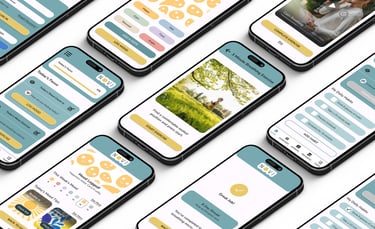
FIGMA PROTOTYPE
INTERFACE DESIGN
NOVI’s interface was designed to feel calm, simple, and easy to navigate. The layout prioritizes quick daily actions such as mood check-ins, micro-exercises, and habit tracking, using soft colors and clear visual hierarchy to support a focused user experience.
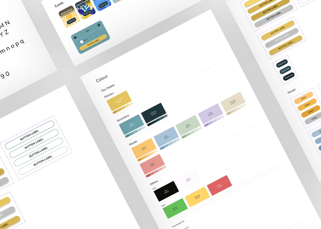
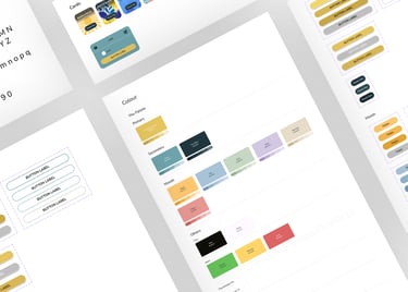
DESIGN SYSTEM
NOVI’s design system establishes a clear visual language through color, typography, and reusable interface components. This structure supports consistency across screens and simplifies future product expansion.
OUTCOME + REFLECTION
NOVI was designed as a UX-first concept focused on consistency. The core flow reduces cognitive load by making the user’s daily session short, calm, and clearly structured, supporting wellbeing without demanding a lot of time or attention.
Run usability testing to validate time-to-complete and clarity of the progress logic.
Add accessibility checks (contrast validation, tap target sizing, and clearer states for selected emotions).
Expand the exercise library while keeping the “one short daily action” philosophy intact.
What I’d do next
Tools Used
Figma · Illustrator